Welcome to the latest updated version of Stacker News Media Kit & Brand Guidelines v1.2, a pivotal location where all the visual elements find place and help us understand how to use them to have our communications cohesive. SN brand identity is built on simplicity, trust, innovation and a taste of Texas's Wild West. With the following guidelines, as promised, I'll try to outline the essential elements of SN visual language to be easily usable internally and externally.
As third interaction from the previous discussion, here below you will find all the media assets in PNG and SVG downloadable from this zip file. BTW: I've been using Nostr 🌸 Blossom Serverservers check them out, it's a really cool idea! In case the file will be not available we can always upload it in other servers. Just let me know if any issue downloading it, ideally I made three copies available from:
The source file of all these assets still are the same Figma file and the PenPot file. This last one, has many issues and does not allow yet the same flexibility as Figma. Both files are open for contributions and comments, just need to register a dummy/anonymous account for each of the tools.
Note: To use these assets across SN, just copy-paste the image relative code, i.e.:
SN logo is the most recognizable visual identifier of Stacker News. It captures the essence of its brand and is to be used across the platform and other marketing materials consistently. Find below all the possible variations and colors. Ideally you should stick with it to maintain SN identity coherent, or propose something new if you feel like. If you have any question on how to place or use the logo, DO ask below, and we'll help sort it out.
| Avatar on transparent BG | Avatar on BG | Logo Extended | Logo Vertical | # |
 |  |  |  | Oil Black |
 |  |  |  | Golden Yellow |
 |  |  |  | With Shadow |
This is the typography SN had used to create its logo. Download LightningVolt OpenType Font file.otf designed by Honey&Death, install it in your computer and play with it.
Typography is essential to identify, increase readability and create consistency of brands. SN uses the default font-family:sans-serif; of your device's OS, usually are the most common and already installed in your device: system-ui, "Segoe UI", Roboto, "Helvetica Neue", "Noto Sans", "Liberation Sans", Arial, sans-serif, "Apple Color Emoji", "Segoe UI Emoji", "Segoe UI Symbol", "Noto Color Emoji". Those are mostly used for:
Example paragraph text
The fonts selected will help to communicate the personality of the brand and provide maximum legibility for both print and screen.
Example <code>
For code, the approach is the same. Let's the device OS select its default monospace one. For example, on Mac will be one of the following:
SFMono-Regular, Menlo, Monaco, Consolas, "Liberation Mono", "Courier New",`
A thoughtfully curated color palette gives SN trust, professionalism, and approachability. Colors play a key role in creating consistent visual experiences through digital and print communications. Make sure you are using the right color codes below:
| # | Name | HEX code | RGB code | HLS |
| Bitcoin-only | #F6911D | rgb(246,145,29) | hsl(32,92.3%,53.9%) |
| Blackr | #000000 | rgb(0,0,0) | hsl(0,0%,0%) |
| Dark | #121214 | rgb(18,18,20) | hsl(240,5.3%,7.5%) |
| Gold | #FADA5E | rgb(250,218,94) | hsl(48,94%,67.5%) |
| Gray | #969696 | rgb(150,150,150) | hsl(0,0%,58.8%) |
| Light | #F0F0F0 | rgb(240,240,240) | hsl(0,0%,94.1%) |
| Nostrch | #8C25F4 | rgb(140,37,244) | hsl(270,90.4%,55.1%) |
| Pinkish | #E685B5 | rgb(230,133,181) | hsl(330,66%,71.2%) |
| Ruby | #C03221 | rgb(192,50,33) | hsl(6,70.7%,44.1%) |
| Sky Hover | #007CBE | rgb(0,124,190) | hsl(201,100%,37.3%) |
| Sky Links | #2E99D1 | rgb(46,153,209) | hsl(201,63.9%,50%) |
| Sky Visited | #56798E | rgb(86,121,142) | hsl(203,24.6%,44.7%) |
| So Fiat | #5C8001 | rgb(92,128,1) | hsl(77,98.4%,25.3%) |
SN utilizes a set of bespoke icons that support its communication internally across the platform. Icons help bring instant, intuitive cues for various types of content and features. We share them here for you so you can use as you wish and satisfy your creative needs.
 |  | [Bounty](https://m.stacker.news/75607) | [Caret](https://m.stacker.news/75608) | [Cowboy](https://m.stacker.news/75609) | [Sun](https://m.stacker.news/75610) |
[Edit](https://m.stacker.news/75611) | [Gun](https://m.stacker.news/75612) | [Horse](https://m.stacker.news/75613) | [Info](https://m.stacker.news/75614) | [Moon](https://m.stacker.news/75615) | [Lightning](https://m.stacker.news/75616) |
[Bald Lost Hat](https://m.stacker.news/75617) | [Markdown](https://m.stacker.news/75618) | [Nostr](https://m.stacker.news/75619) | [Referral](https://m.stacker.news/75620) | [Rewards](https://m.stacker.news/75621) | [Horse Lost Saddle](https://m.stacker.news/75622) | [Search](https://m.stacker.news/75623) |
[Shoot](https://m.stacker.news/75624) | [Texas](https://m.stacker.news/75625) | [Upload](https://m.stacker.news/75626) | [Zap Zap](https://m.stacker.news/75627) | | |
Banners are important visual elements used in our digital platforms and marketing materials. They help to highlight key stories, features or announcements while maintaining our brand aesthetic.
Here below you'll find custom banners for Sn and for individial territories. I try to build those that I follow most, for now @AGORA is the only one that designed its own banners. Comment below if you'd like some banners for your territory!
| 970x250 |
 |  |  |
| 728x90 |
 |
| 970x250 |
 |
| 250x250 | 300x250 | 300x600 |
 |  |  |
| 728x90 |
 |
| 970x250 |
 |
| 250x250 | 300x250 | 300x600 |
 |  |  |
| 728x90 |
 |
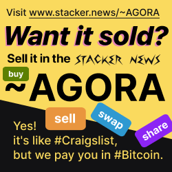
The SN P2P Marketplace
| 970x250 |
 |
| 250x250 | 300x250 | 300x600 |
 |  |  |
| 728x90 |
 |
| 970x250 |
 |
| 250x250 | 300x250 | 300x600 |
 |  |  |
| 728x90 |
 |
| 970x250 |
 |
| 250x250 | 300x250 | 300x600 |
 |  |  |
| 728x90 |
 |
| 970x250 |
 |
| 250x250 | 300x250 | 300x600 |
 |  |  |
| 728x90 |
 |
| 970x250 |
 |
| 250x250 | 300x250 | 300x600 |
 |  |  |
| 728x90 |
 |
If you feel something is missing, or you know a better tool to manage this media kit for SN in a collaborative and FOSS way then, DO share it in a comment below
Territory owners , do you need banners for your territory? Feel free to edit the figma file liked above or comment below sharing your needs or ideas, I'll try to do something for you.
By following these guidelines, we ensure consistency and professionalism in every case where Stacker News is represented here internally to stackers or to our audience in the KYC internet, reinforcing SN credibility as a trusted source for data-driven journalism.
Things to add on next version:Things to add on next version:
Great work! Thanks for doing this.
Thanks for running few successful territories!
If you like to contribute, here is a collaborative markdown editor
Collaborative markdown editor, neat!
Edit: why can't I zap pinned comments?!
Probably because is pinned... you need to click on Xreplies to access the item and zap from there. Or I can just unpinn it, easier!
Wow! That's impressive work.
Thanks, make use of it!
Yes I would like a banner for stocks and construction!
I am trying to do more advertising for my territories
Also going to use zaps on podcasts to help get the word out and bring new users to stacker news. Having a few banners for my territories can help with my rudimentary marketing strategy.
That's great! Construction is one that sometime I dive in too. If you like, share some references so we can work together with the inputs of the community for each territory.
For ~Stacker_Stocks here #873112
For ~Construction_and_Engineering here #873104
Thanks for posting the updated version. I am going to fiddle with some stuff next week. I am still playing with my “You should be on Stacker News” marketing idea. I tried to do some stuff with AI but didn’t like anything it produced.
Ai... yes cool it helps! But like here in SN, do you enjoy reading Ai articles? Me either... nor I enjoy or feel particularly attracted by Ai image generation. You can be the best prompt-writer, however you'll limit the results by its tech boundaries.
I like the idea "You should be on Stacker News", reach out, I might be able to help you out with the visualization of it
Absolutely incredible work!!!
I need to make some banners for my territories and add them to this.
Please don't use fiat fivvverrr... Share your idea on ~Design and I (or maybe some other stacker) will help
You forgot the Alice in wonderland gifs from a previous era of branding. They're still here e.g.: https://stacker.news/404
🤣 ahaha when the 404 was showing up more often! Thanks for the reminder, I'll add them all to the collection. Where are all the others? Offline, 500 error etc... ?
Yes but Idk how to force the 500 gif reliably.
We should do an accessibility review on a few of the color combinations in light mode and in some of the banner images with text, but for the most part everything has really good contrast in the default dark mode. Very nice to have the design guide as a tool to keep everything consistent. Love the icons. Great work!
Thanks for your feedback, I checked with some accessibility tools, and you right, does not look's good enough. You're welcome to double-check and evaluate possible improvements to be summarized in a GH issue.
@Design_r Sorry it took me a bit to get around to this. Created a GH Issue here with a recommended usage table for color contrast accessibility of existing brand colors: https://github.com/stackernews/stacker.news/issues/1922
Feel free to comment or ask questions on the issue directly. Hoping to open the conversation on what voluntary standards or guidelines we can use to make the content more readable and usable for all.
This is great! Thank you for taking time making this important analysis. Unfortunately have no GH account (yet), I'll keep an eye on the conversation and I'll take the results you gathered to find similar colors that match the accessibility standard as you suggested.
Great! I can help you with that :)
deleted by author
Thanks for sharing! It seems from your username, you must be the designer who designed all of this. Great work! Predyx needs a good designer as well, how or where can we find someone as good as you?
You find me here. I'll be happy to help you, depending on your needs and requirements or point you in the right direction to find someone else with the skills you need. Reach out via email or nostr DM
deleted by author
Great one! bookmarked.
"Stacker News: The Bitcoin Powered Community"
I'm not sure that's exactly it, but I'd love to have a SN banner that's a bit broader than the ones we have already.
I want bitcoiners to know that there's a place they can discuss whatever they're into. Have you come across any nice slogans for that?